I love creating PowerApps but sometimes I want to make my apps look different to what PowerApps provide out of the box. However I’m not a designer and I normally would use a nice UI style library like Fluent UI (formerly Office Fabric UI) to do the design work for me. You can do the same in PowerApps but it takes a bit of up front work and in this blog I will show you how to do just that.
Pick an existing UI library
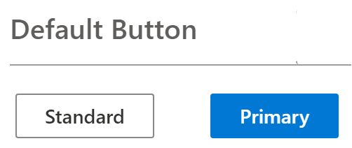
First of all find a UI library or UI controls that you like. I will be using the Fluent UI Button control:
NOTE: The PowerApps “Office Blue” theme is very similar style to Fluent UI but you can apply the same concepts using any UI library.
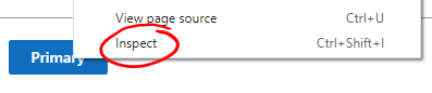
Now use the developer tools of the browser and inspect the control. I’m using Google chrome to right-click the button control and select Inspect:
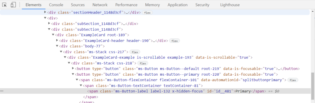
Now from the Developer tools pop out menu in the Elements tab you will see the HTML code for the control you are inspecting (you might need to click around the different divs):
Then look in the Styles area where you will see the CSS properties:
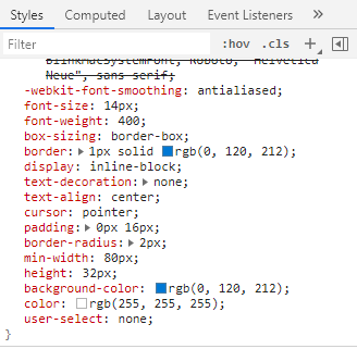
Look for the relevant CSS property that corresponds to the PowerApps control property. For reference, below is a table to show you comparisons. I’m only using common Color and border properties and some Size and location properties for a control because these are most of what you need to style controls the way you want.
| PowerApps properties | CSS properties |
|---|---|
| BorderColor | border-color |
| BorderStyle | border-style |
| BorderThickness | border-width |
| Color | color |
| DisabledBorderColor | border-color |
| DisabledColor | color |
| DisabledFill | background |
| Fill | background |
| FocusedBorderColor | border-color: focus |
| FocusedBorderThickness | border-width: focus |
| HoverBorderColor | border-color: hover |
| HoverColor | color: hover |
| HoverFill | background: hover |
| PaddingTop PaddingBottom PaddingLeft PaddingRight | padding |
| PressedBorderColor | border-color: active |
| PressedColor | color: active |
| PressedFill | background: active |
| RadiusTopLeft RadiusTopRight RadiusBottomLeft RadiusBottomRight | border-radius |
| Size | font-size |
Bonus tip: Create CSS global variable in PowerApps
I found this neat trick to create a CSS like global variable, which makes it easier to set properties for controls and then update all of them at once if you ever want to. For more details see this excellent article by Summit Bajracharya: https://summitbajracharya.com.np/css-in-powerapps/
So for a Fluent UI Button I made note of the relevant CSS properties and using the table above I matched them to PowerApps control properties. Then I create a global variable in the App’s OnStart property, which you can find below:
Set(fluentUIButtonCSS,{
    borderColor: RGBA(0, 0, 0, 0),
    borderStyle: BorderStyle.None,
    borderThickness: 0,
    color: RGBA(255, 255, 255, 1),
    disabledBorderColor: RGBA(0, 0, 0, 0),
    disabledColor: RGBA(161, 159, 157,1),
    disabledFill: RGBA(243, 242, 241,1),
    fill: RGBA(0, 120, 212, 1),
    focusedBorderColor: RGBA(0, 0, 0, 0),
    focusedBorderThickness: 1,
    font: Font.'Segoe UI',
    hoverBorderColor: RGBA(0, 0, 0, 0),
    hoverColor: RGBA(255, 255, 255, 1),
    hoverFill: RGBA(16, 110, 190, 1),
    pressedBorderColor: RGBA(0, 0, 0, 0),
    pressedColor: RGBA(255, 255, 255, 1),
    pressedFill: RGBA(0, 90, 158, 1),
    borderRadius: 2,
    fontSize: 14
    }
);
Now in PowerApps drop a Button control onto your canvas and for each of its properties set them to the corresponding variables we just created. For example in the BorderColor property type the variable name then the matching value – “fluentUIButtonCSS.borderColor”

Once you are done setting all the properties you will see the end result. Here is a before and after comparison:
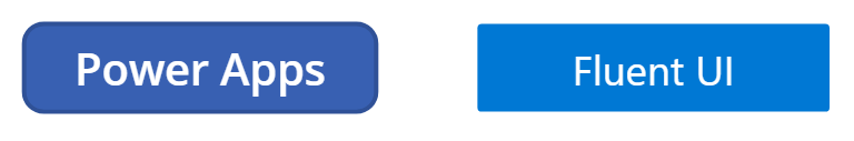
You can apply these same tricks to other controls like Text input, Dropdowns, Checkboxes etc. Also using the same concepts you can style your PowerApps controls using inspiration from other UI styles and libraries like Material UI, Bootstrap etc.
 Suresh Memmi